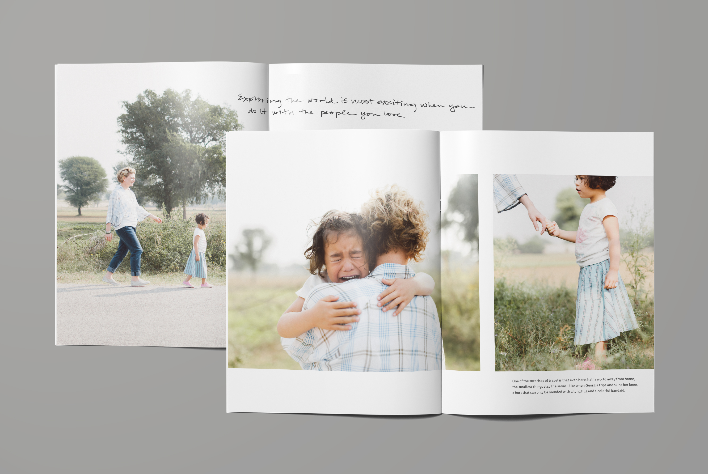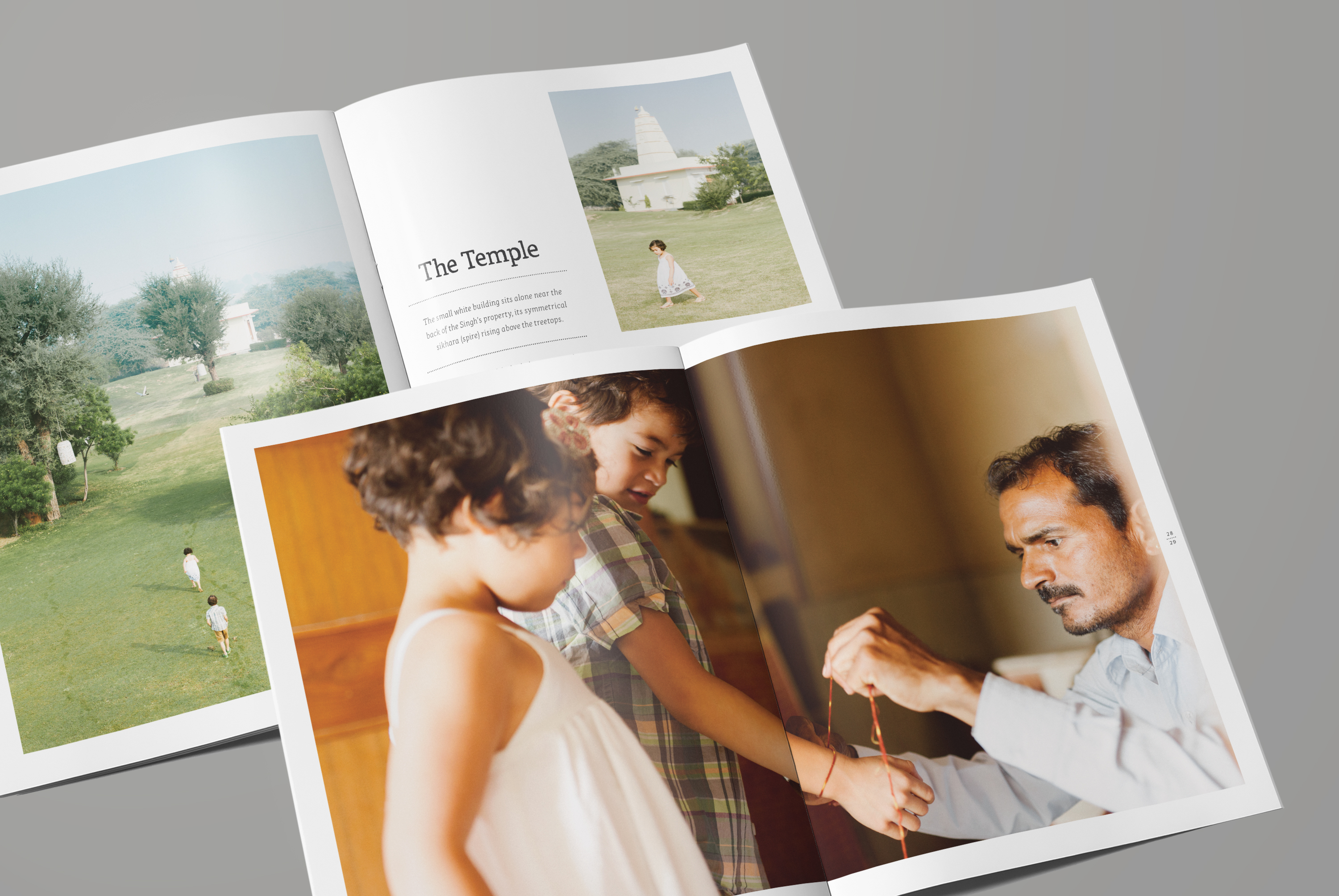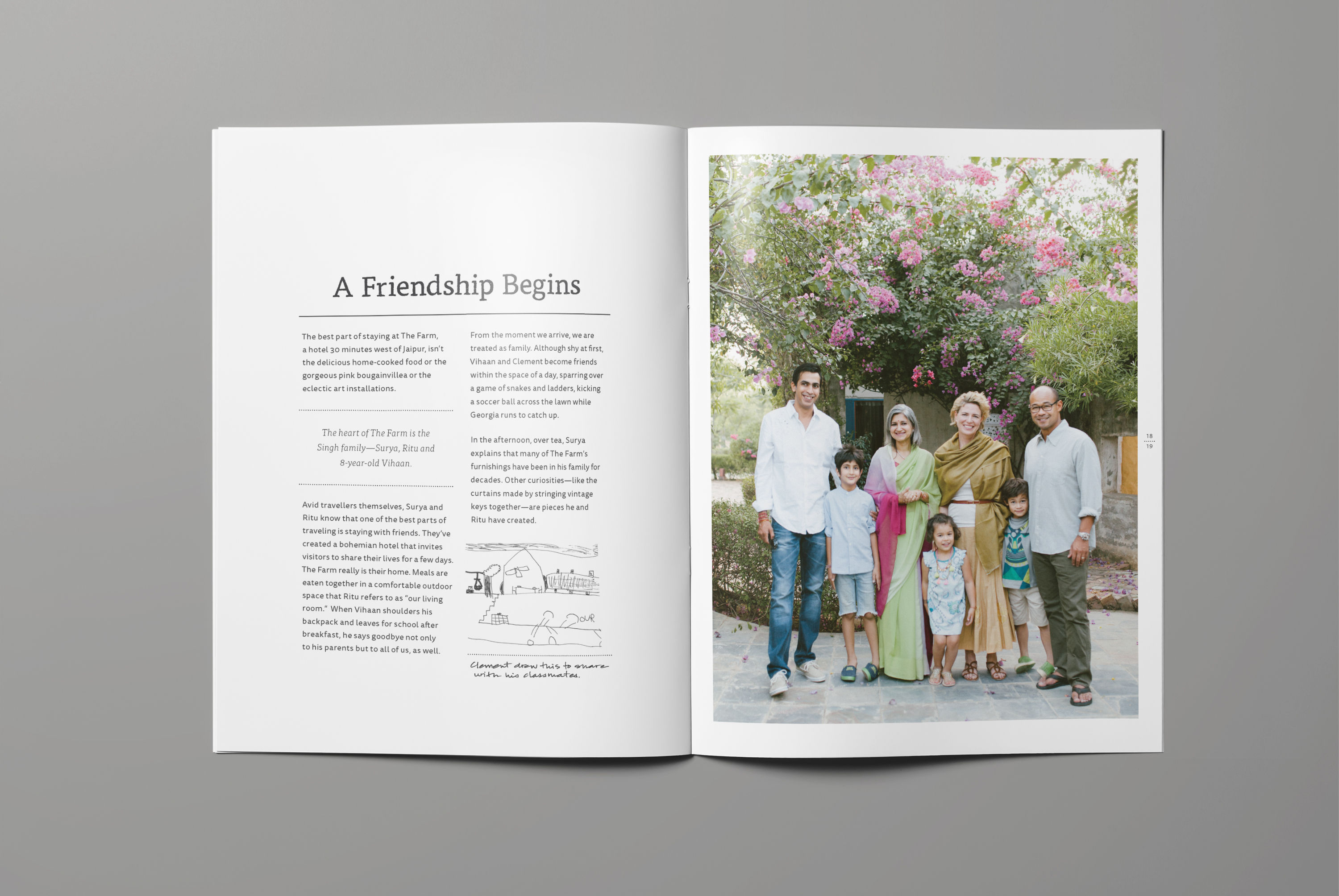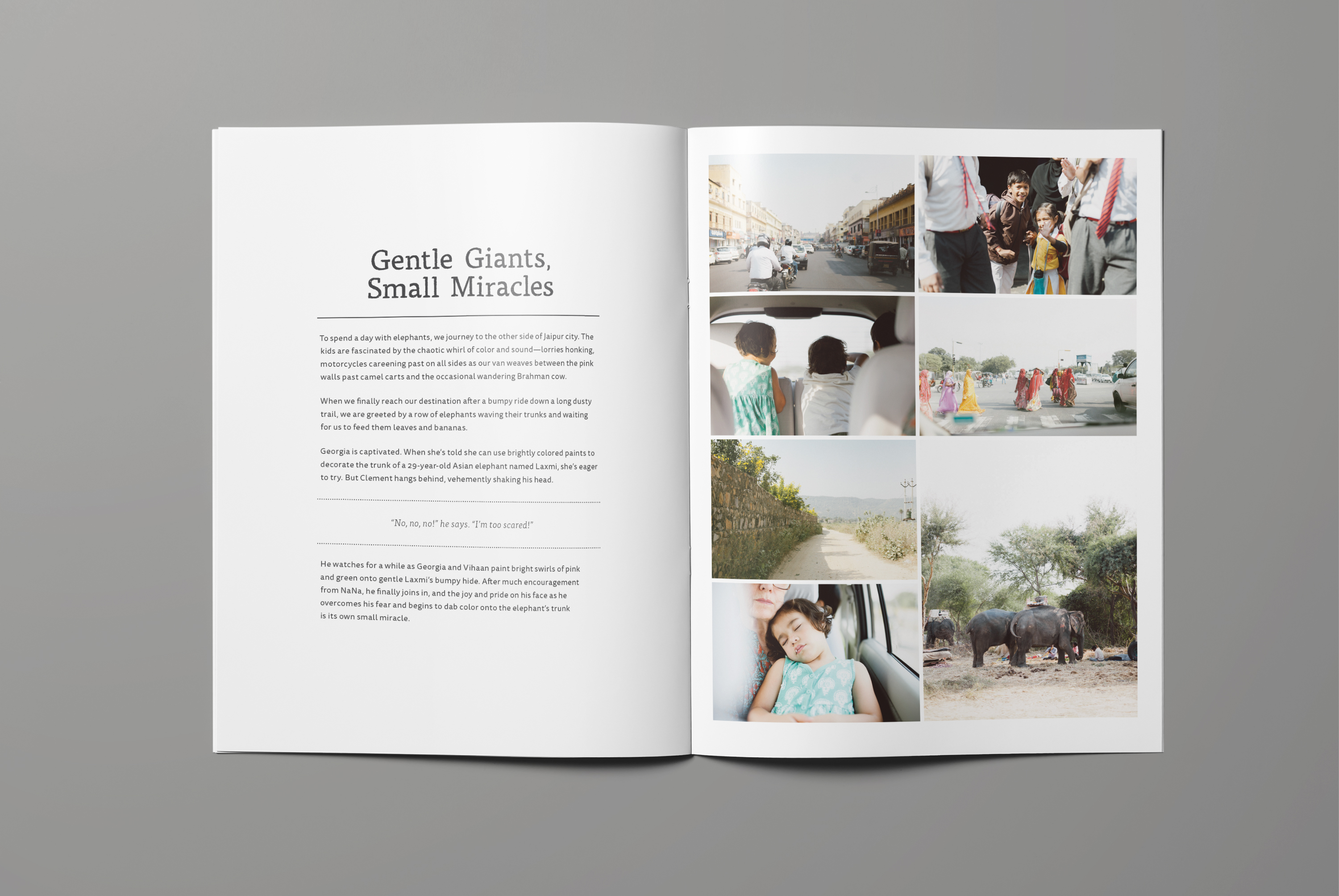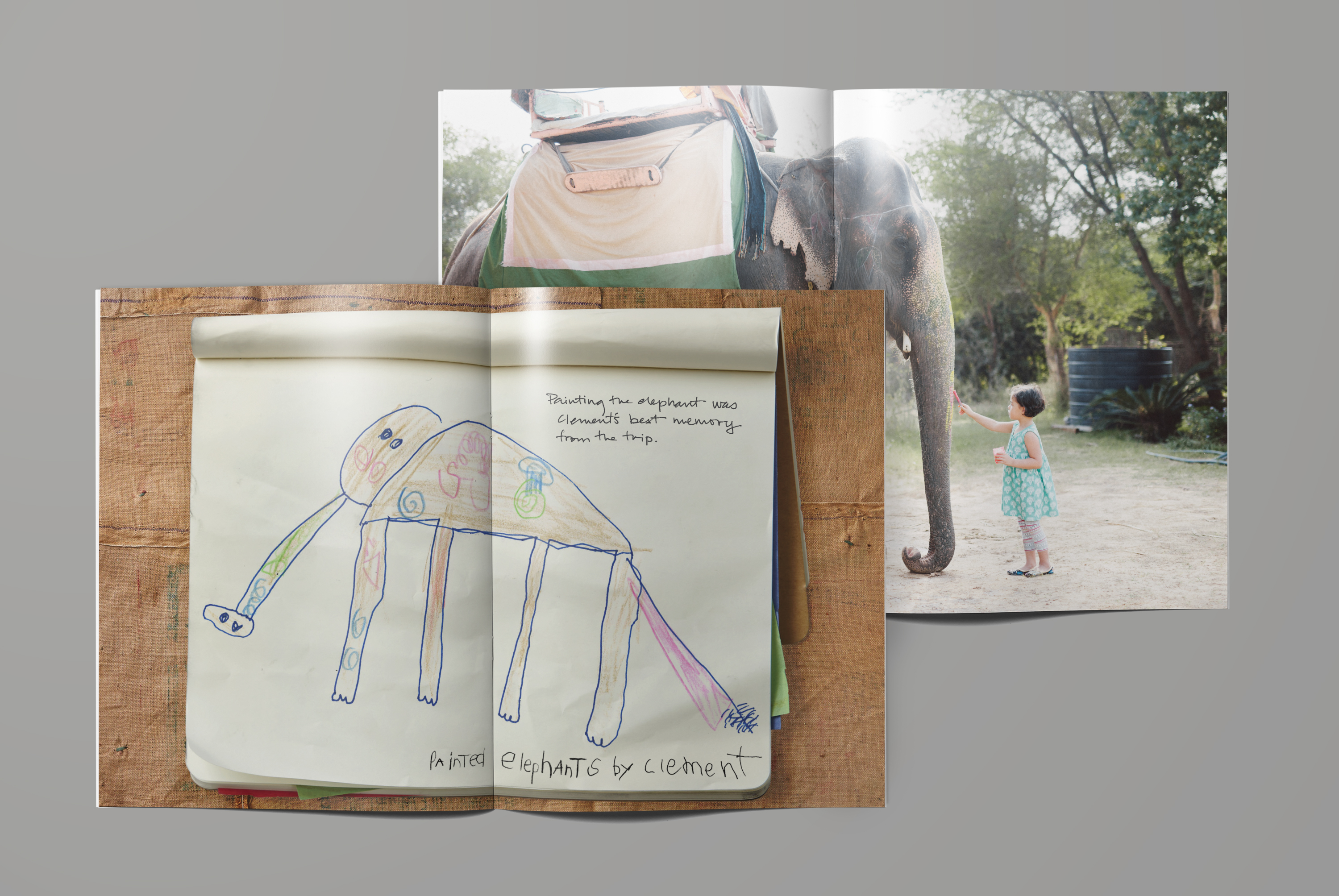
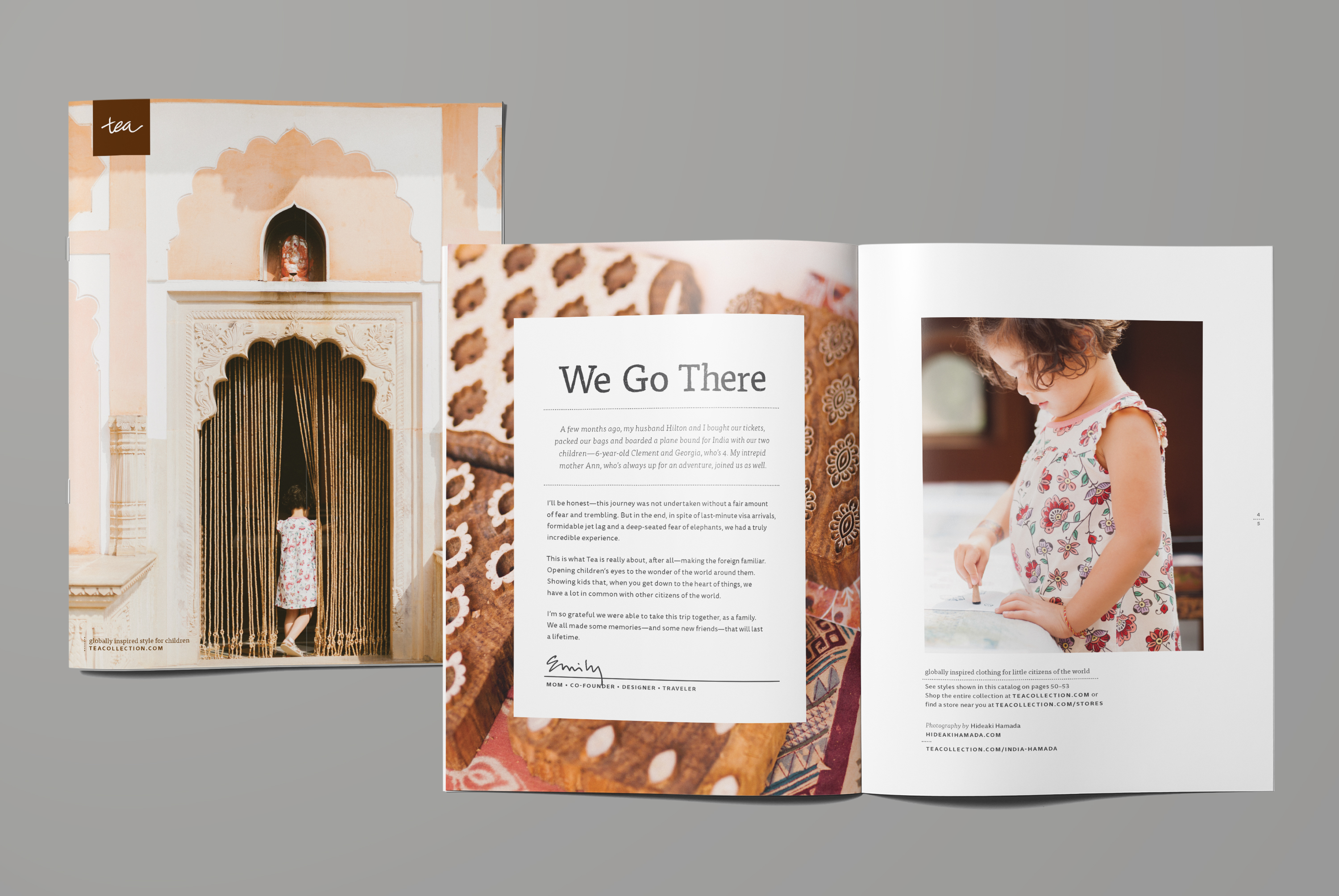
Tea Collection is about making the foreign familiar and lives by the mantra "we go there". Never was this more true than in this summer India catalog. It tells the editorial story of two real kids from the US on their adventure in Jaipur, India with their family.
role:
• layout & graphic design
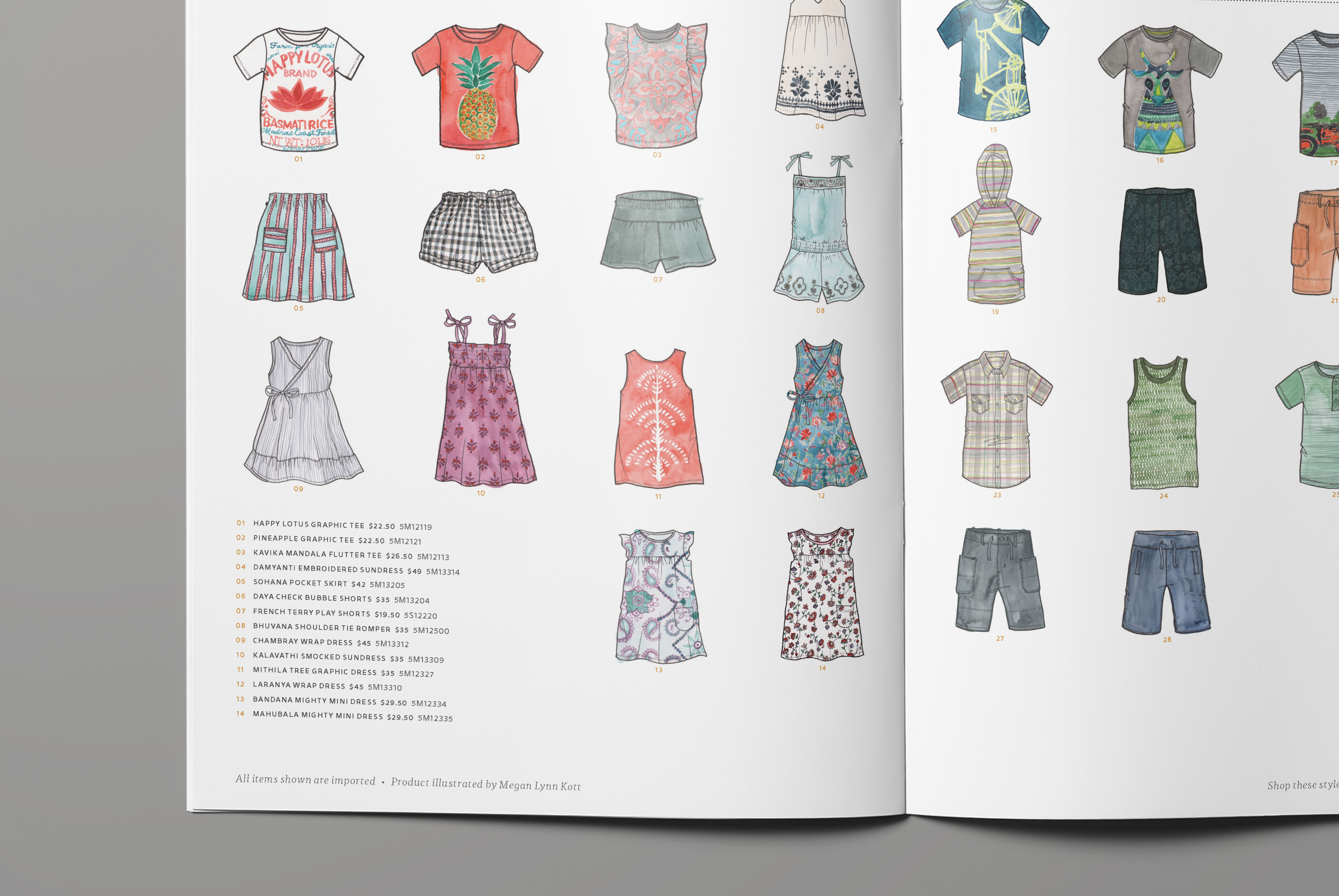
• art direction of product illustrations
• hand-drawn custom typography
• design direction
• managed image retouching
• attended press check
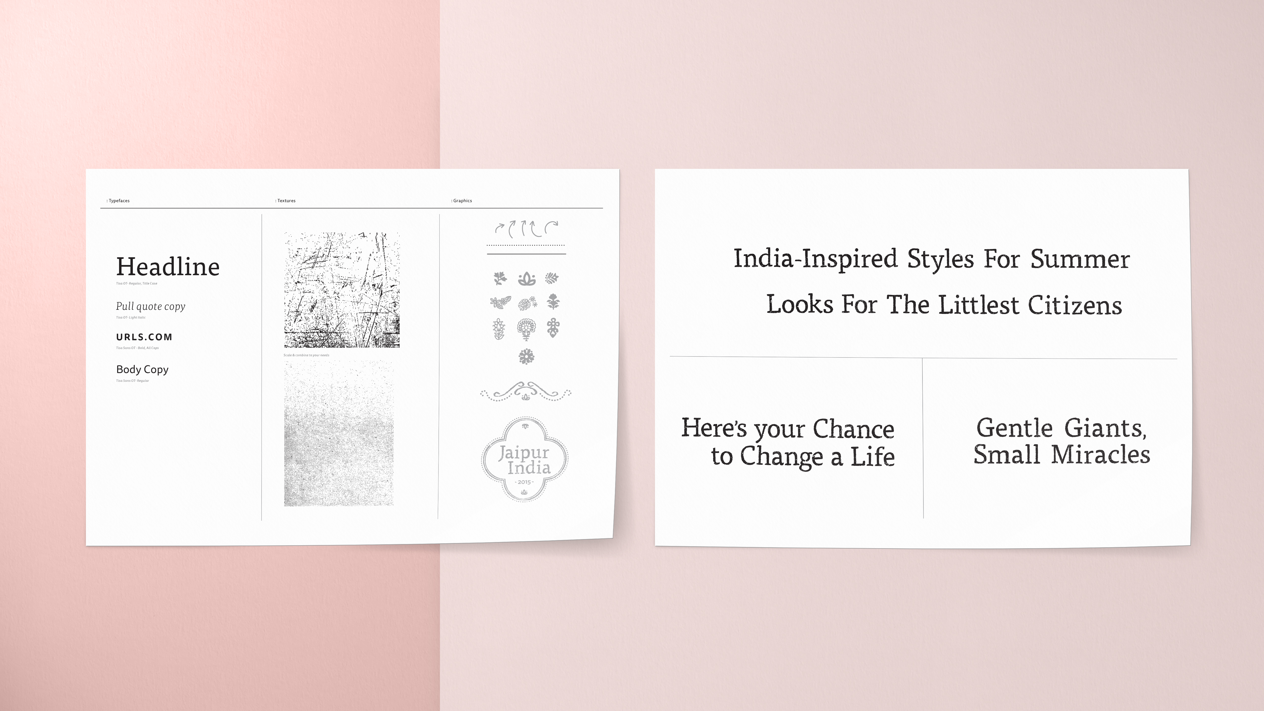
At it's heart, this editorial catalog was telling a core brand message. As a result, I felt that using Tea's brand typeface Tisa was the most appropriate. However, I wanted to give the type a warmer and more aged look to reflect the location featured and photography used. I hand drew, digitized, and distressed Tisa to give this catalog a subtle but inspired look.